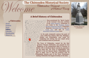
The Chittenden Historical Society has long been awaiting an update for their web site. Originally designed as a compact size window with scrolling elements within the window, it appeared dwarfed on modern screens. Now wider and with no height restriction, the content height will fill the browser window and scroll when needed.
Other improvements include a text wrapped irregular image on the homepage as well as a consistent photo gallery that allows full screen viewing of higher resolution photos. Some pages use the added width for additional content in right and left columns and a new “Links” tab was added to the “About Us” page. Now to get my other clients on board with updating their out-dated web designs.


Recent Comments